Data visualization with the ODV module
With the late 2020 upgrade to Alma, Primo and Leganto Analytics, as well as a more modern looking user interface style, a new data visualization module from Oracle is included. This chapter will consider its features and explore its use. ODV is a comprehensive product with a great deal of functionality, so, while we will, of necessity, only be scratching the surface, we will aim to provide a platform for progress.
So, what is it for, and how is it different to the standard analytics package?
Regard Analytics as being the mechanism by which you process and manipulate the data available to you in Analytics. ODV is an additional means to explore and visualize this data. It provides some functionality in common with the graphing views of Analytics but extends them. There are tools for data set preparation, a visualization mode and a narration mode. The narration mode allows the construction of a presentation using your visualizations. In addition, ODV will allow import of data external to Ex Libris systems for the purposes of exploration and visualization, either independently, or merged with your data hosted by Ex Libris. So, for example:
-
You could import footfall data from an access control system such as Sentry.
-
You can process and visualize this imported data.
-
You can merge this data with, for example, circulation data.
-
You can visualize the merged dataset.
The Analytics and Visualization components exist side by side and are integrated to some extent. The two components share the catalog for storage of analyses and visualizations. You can open Analytics objects from the ODV catalogue view and ODV objects from the Analytics catalogue view. A new browser tab will be opened in each case.
Throughout this chapter, remember to frequently save your work so far in your 'My Folders' area.
Navigating & Using ODV
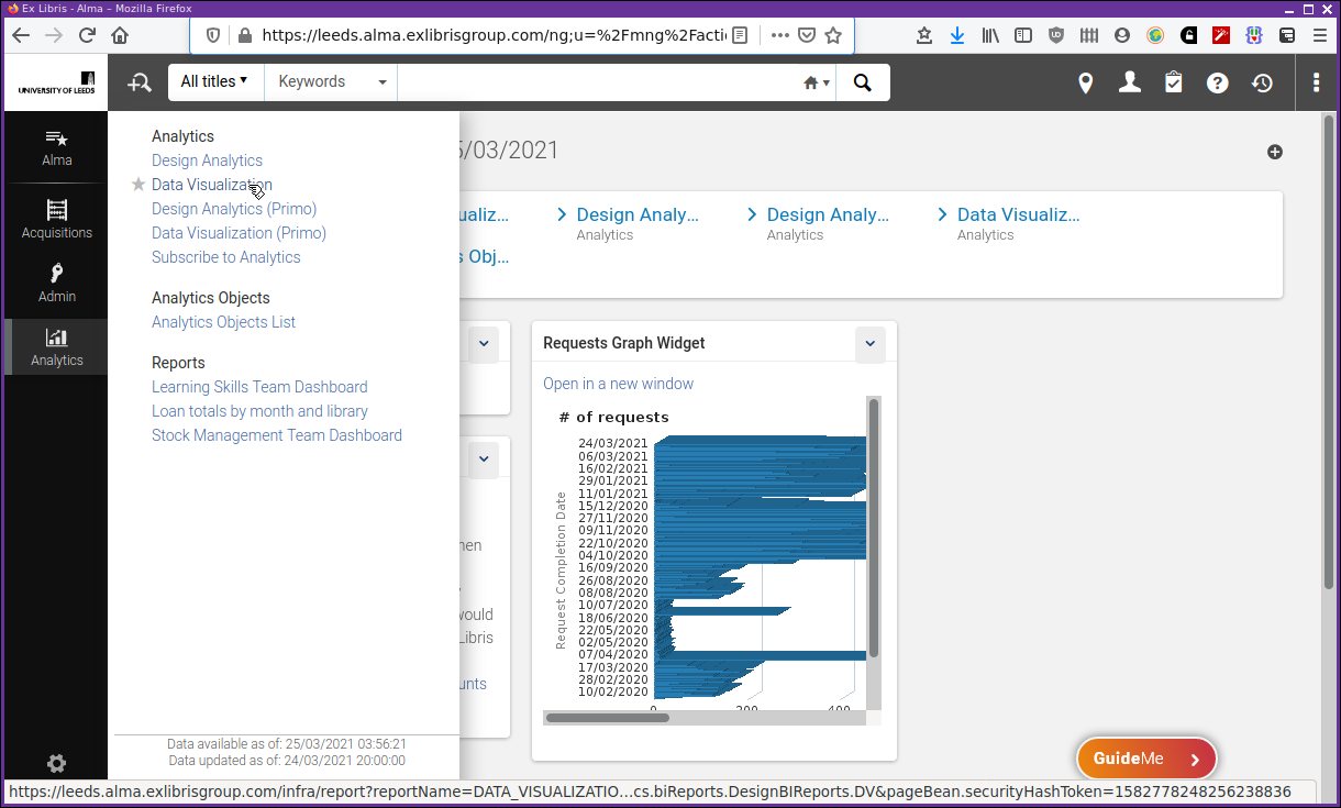
Start ODV similarly to starting Analytics. Select the menu for Analytics followed by "Data Visualization" or "Data Visualization (Primo)" as shown in Figure 1. It may also be available from the "Recent Pages" banner.
After a short wait, and some strange quotes or pearls of wisdom, a screen something like Figure 2 will be displayed.
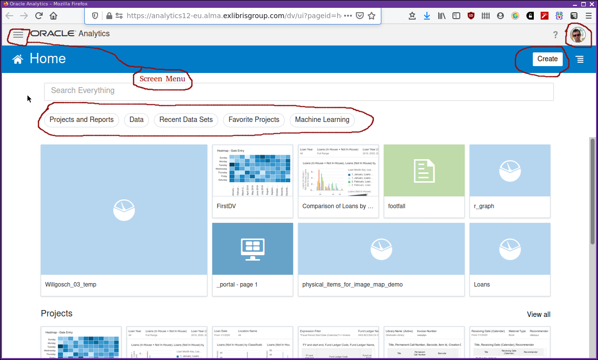
It’s a modern, flat style of interface. Exactly what you see on the screen will differ depending on your institution and personal set up. There are a few components to immediately note. The "Create" button, and the main screen menu, the ubiquitous three layer, "hamburger" style menu. There is a row of "pill" style buttons that apply a filter to the displayed objects from the catalogue. There is a profile button just to the right of a help question mark button in the top right. The profile button allows you to edit some basic information, select a profile picture, etc. At the moment (March 2021), the help question mark button does not appear to provide any functionality.
As with Analytics, feel free to poke around and try things. You can’t delete your data, as with Analytics it is a data read only system. At least for the data that is held by Ex Libris and extracted from Alma, Primo and Leganto. You can delete data that you have uploaded yourself. You can delete datasets that you have created from data held by Ex Libris in the subject areas. In this case it’s possible to re-upload that data or to recreate the datasets from the subject areas. It is possible to overwrite one of your own project definitions if you are not careful, again similarly to in Analytics. When saving work, using "Save as", or the first time a project is saved, be a little careful about its location and name. But, as with Analytics, do not hesitate to try things out.
Notably, the Oracle "Academy" is available from the "hamburger" style menu in the top left of the screen. This provides access to some tutorial videos and the Oracle documentation. The tutorial videos are based on data for a retail organization, but they are useful in providing an idea of the capabilities of ODV.
What can be created in ODV? Selecting the "Create" button reveals a panel of options: Project, Data Set, Data Flow, Sequence, and Connection.
-
Project — A project is the place where you collect together data sets, data flows, sequences and connections in order to create a visualization.
-
Data set — A data set is a collection of data, it can contain data items from multiple sources. The data is derived from the "subject areas" within the Ex Libris analytics data world. Source can also be external data sources via a "connection" or can be data imported from spreadsheets or CSV files, for example.
-
Data flow & Sequence — Data flows and sequences are used to describe a set of processing steps used to construct a data set for analysis and visualization.
-
Connection — A "connection" is a connection to a data source. Many types of data source are available. For example, it will be possible to create data connections to Google Drive, or to databases within your organization. Connections to different types of data source will be different in the detail but all will, in common, specify a connection name, where to connect to, and details of any required authentication.
Previously, we have talked about understanding our analytics data, it’s extraction and storage, and the operations performed on it, all taking place before we even get to see it. Remember ETL, extract, transform, load. This is what is taking place in these data flow and sequence operations we are talking about above. We are constructing our own ETL sequence for our own data sets.
We take a look around in the video ODV — Getting started.
Working through a dataset creation, exploration and visualization
We will work with library data to do with physical requests again. We will establish a data set, set up a project with it and do a little data exploration and visualization. Bear in mind, this is intended to show how to construct the visualization and the processes involved rather than be useful for any particular library need. As always, we will be getting the "data ducks in a row" before analysing and visualizing.
Setting up the data and project
We will use data from the familiar "Requests" Analytics subject area. We’ll take the:
-
Request Date
-
# of Requests (the number of requests)
-
Total Request Time (Days)
-
Owning Library Name
-
Request Type Description
We shall filter on the "Request Date" to just use the 2019 data. We shall round the request time to a whole number of days. We will only be looking at "Patron Physical Item Requests". All familiar stuff from previous chapters.
We are extracting and selecting data from "Requests", applying some transformations for our particular purposes and creating the dataset that can be loaded for exploration and visualization in ODV. So, it’s more or less the standard ETL processing pipeline.
The Request time data is delivered as a real number, e.g. 12.347 days. We will round this to 12.0 days and then cast the real number to an integer.
e.g.

CAST(ROUND(12.347,0) AS INTEGER) = 12

or more generally,

CAST(ROUND(Total Request Time (Days), 0) AS INTEGER)

but, the CAST function on its own is sufficient, so

CAST(Total Request Time (Days) AS INTEGER)

works as well|
Type casting of values
A "type cast" is the mechanism whereby a value of one data type is changed to the corresponding value in another data type. For example, the integer value 34 can be cast to the string value "34". This is a very frequent operation in computing so that, for example, the integer value represented by the string "34" can be added to another integer. It can happen explicitly as when using the "CAST" function in Oracle, as above. It can happen implicitly as in the following interactive Python programming language session. The variables x and y have different types but can be added together. Python takes care of the details. |
| This step is not strictly necessary, in a visualization the formatting of displayed numbers can be adjusted. It is included as an example of manipulating data in your constructed dataset pipeline. It’s easy to imagine extensions of this where your pipeline constructs new data by manipulating or performing calculations on your existing data. For example possibly, as we have seen previously, constructing a ratio of requests per copy. |
In the next two videos we will take a look at setting up a dataset and setting up a project. These tasks are closely related. You can’t have a project without it using a dataset. When a project is created the very first step is to create or specify a dataset for it to use. There can be no progress without this first step. Of course, a dataset is not much use without something using it.
We will take a look at creating the dataset first and then having a project use it. I prefer this way as it’s possible to define a dataset and have multiple projects use it. So, it’s trying to think a little about possible multiple uses of our datasets. It’s perfectly fine to create a project and define the dataset within it as well. Personal preference, as much as anything, plays a part here.
Follow along using the videos ODV — Setting up a dataset and ODV — Setting up a project.
Exploring and visualizing the data
Using our data set we can begin to explore and visualize the data we have selected. We’ll be taking a look at the distribution of requests (# of requests) over the year. We’ll take a look at the number of days to fulfil the request, can we identify what are normal and abnormal processing times? Can we see any correlation between the number of requests and the amount of time taken to process them? Is the amount of time taken dependent in some way on the number of requests? How can we attempt to show this using the available visualization tools?
The accompanying video is ODV — Exploring and visualizing data.
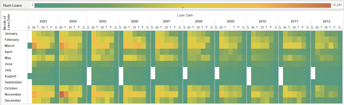
I’d like to make particular mention of two types of visualization, the heatmap and the treemap. These are often useful for showing trends and identifying peak periods. For example, the image in Figure 3 shows how physical loans were reducing at Lancaster in the years 2002-2012. It clearly shows both the trend over the years, and the busiest day of the week in each month. So, Mondays in November 2004 were 'peak physical loans'.
In the video ODV — heatmap and treemap, we take a look at using these two visualizations in ODV in the context of physical requests data that we have been working with.
Making use of your own data
This is an eye-catching feature. With the ODV module it’s possible to gather data external to the Ex Libris systems suite and import it into ODV for analysis and visualization. Previously, if analytics work that integrated data from other systems and Ex Libris system was required it would be necessary to; prepare data from external systems using whatever tools were available, export the required data from Ex Libris systems, merge the data from the two sources using appropriate criteria and tools, then carry out the required data analysis. That is quite a large amount of work and expertise that is needed.
If you can connect to external, to ODV, data sources or at a minimum, collect CSV files to ingest you will be able to work with data from all your relevant sources within ODV. You can think of this as using ODV data import facilities as being a little like adding you own data subject areas.
Let’s consider the mechanisms involved in all of this using the following context:
-
We would like to consider physical item loans.
-
We would like to merge this activity with data from our physical gate access system (Sentry, or the like). Let’s call this the footfall data.
It’s a simple context to work with, in the sense that the more people enter the library, the more loans there are likely to be, but it is one which allows us to take a look at the processes involved.
For our footfall data we have some data from the University of Leeds Sentry
access control system for the Edward Boyle Library. The data is provided in the
file footfall.csv, containing data for
the day October 1, 2019. It is not raw data from the Sentry system but has been
processed to remove personal identifier information, i.e. card numbers.
The first few lines of this file look as follows:
footfall.csv"EventID","Dirn","Entry-Exit Name","Date","Time"
"132b00fe","Out","Near exit","10-01-2019","06:16"
"42b9f126","Out","Near exit","10-01-2019","06:17"
"8d48af39","Out","Near exit","10-01-2019","06:19"
"aff40b87","Out","Near exit","10-01-2019","07:02"
"51c08665","In","Near turnstile","10-01-2019","07:40"
"92a8be78","In","Near turnstile","10-01-2019","07:44"
"563515f8","In","Near turnstile","10-01-2019","08:00"The columns are a generated, unique event identifier, the direction (In or Out), a location name and the date and time (to the nearest minute) of the gate event. The date is formatted in the US style as it seems that is what is expected and there does not appear to a way to adjust locale for importing data[1].
Note the first line has the headings rather than data. ODV when importing this data will make use of this headings line to label your columns.
Referring back to APL Analytics terminology we can think in terms of adding a "Footfall" subject area, with descriptive fields of "EventID", "Dirn", "Entry/Exit Name" and "Time".
Importing data into ODV
We are going to create a dataset, "Sentry-20191001" from the CSV file, we’ll make sure the import is successful, we will adjust column metadata as necessary, and we will create a "H24" column, which contains just the hour the Sentry event took place. This will be used in the next section where we merge with some circulation data. We’ll take a look at the data with some basic visualization and save a project as "IMP-DV1".
Follow along by watching ODV — Importing data.
Integrating imported data with Alma data
We now want to merge our footfall dataset with a circulation dataset. To merge two sets of data we need to have some data column that is common to the two datasets. We are considering the activity over a day, so we shall match the Sentry data with circulation data based on the hour that events took place on that day, 01/10/2019. We are making an underlying assumption that if a Sentry event and a circulation event take place in the same hour then they are related. That the person invoking a Sentry event is also responsible for a circulation event in the same hour. We should consider the validity of that assumption, but also, whether over the course of the day it all balances out. Given enough data it would be statistically possible to test exactly how valid the assumption would be as well as the balances over the day. But, here and now, we are just exploring the surface of our data.
In this next video tutorial ODV — Merging data from two datasets we will create a dataset, "Loans-20191001" and then in the project "IMP-DV1" we will add this dataset, merge with the "Sentry-20191001" dataset and visualize the combined datasets.
|
Behind the scenes in SQL
There is a lot of graphical gee-whizzery going on here that makes it easier to construct and merge datasets that can then be visualized. It may help to consider the SQL that will be going on in the background to help clarify what is going on. We have two datasets or SQL tables, S for our Sentry dataset and L for our loans dataset. The simplified SQL behind the scenes is doing a join on these two tables, matching data by hour, to create a new data table, something like …. |
ODV — final points
There is a copy of my "REQ-DV1" and "IMP-DV1" projects in the Leeds shared folders at "AAPL Training/DataViz" which you can refer to. They should be read only so you can make changes and save them to your own "My Folders".
The feature kaleidoscope
ODV has an incredible range of features and visualizations providing great customization, flexibility, and power, which this author is still getting to grips with. It can be as diverting, distracting, and confusing as looking through a kaleidoscope.
ODV provides a platform for analysing your data held in Ex Libris systems. As well as that, it allows the integration of other data sources to allow you to build a complete data visualization view for your library in its entirety, not just the data held and generated by Ex Libris.
What this material does not contain, as it is a large topic in itself, deserving of its own training material, is much consideration of what visualizations to choose for any particular dataset. Wikipedia[wpdv] is a reasonable starting place to begin looking at these questions.
Lastly, it can be easy to lose sight of the actual questions being asked and hence, making poor choices of visualizations that are effective at answering those questions. Usually simplicity is the key to effective communication. A visualization needs to be only as complex as is absolutely necessary to communicate with it’s intended audience. Or, to rephrase, a visualization needs to be as simple as possible and as complex as necessary[2].
Exercises
-
If you have not already done so, recreate each step in the video tutorials, saving your work in your "My Folders" area.
-
Using one of your multi canvas visualizations so far, click on the "Narrate" panel button and explore creating a presentation using your canvases.