Format and Style
Now we have an idea of how to retrieve and process our data, and what it means, we can now consider how to present it. If the processed data reporting is not sensible and well understood then, even with the best presentation and charting, it will still be misleading, leading to incorrect, useless and possibly harmful actions.
We produce many analyses with tables, so we will consider options for formatting them. We place the analyses on dashboards, so we will also look at formatting dashboards. We follow up with a look at charting. Charts are available for inclusion in analyses. There are numerous chart types, so we will not be able to consider them all. The material provides a guide to getting started with the charts and shows how to use and format them. The suitability of use of any particular chart will depend on your requirements and your data.
Tables
We shall use the analysis "Loans" in the "AAPL Training/format" folder as a base for investigating formatting of tables. The columns definitions, from the "Criteria" tab, are shown in Figure 1.
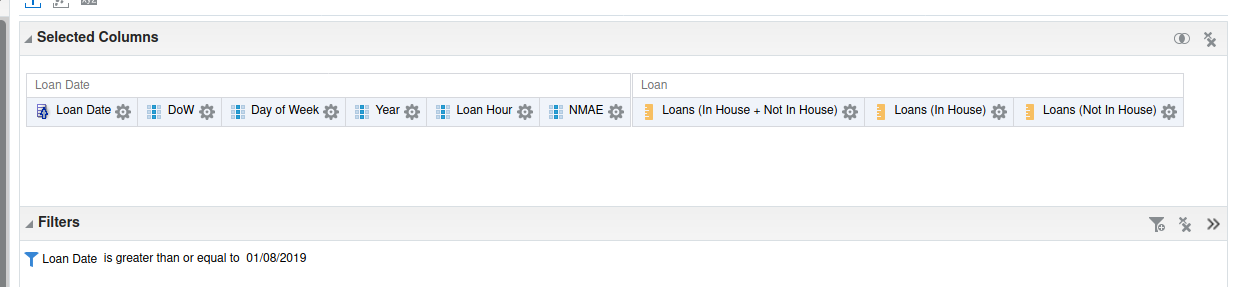
We have three measure columns measuring the number of loans. The dimensions used are:
-
the loan date, "Fulfilment"."Loan Date"."Loan Date".
-
"DoW", the day of the week expressed as a number 1 being Sunday. The column formula is
DAYOFWEEK("Loan Date"."Loan Date") -
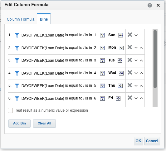
"Day of Week", the day of the week expressed as text, like "Sun". The column has been defined using bins as shown in Figure 2.
-
"Year" defined with the column formula
YEAR("Loan Date"."Loan Date") -
"Loan Hour", defined with the column formula
LEFT("Loan Date"."Loan Time", 2) -
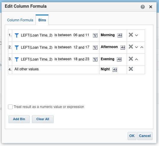
"NMAE", or Night, Morning, Afternoon, Evening defined with bins as shown in Figure 3.
Formatting table containers
Take a look at the results screen, shown in Figure 4, and we can start working through adjusting the formatting of a default analysis.
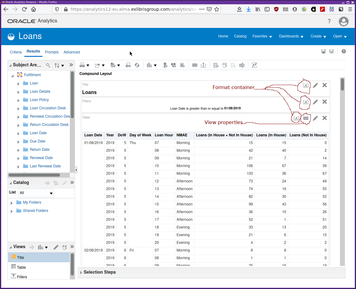
Note the icons for format container,  , and view properties,
 . The format icon , is used wherever it’s possible to
make changes to the default formatting. Clicking on one of the format container
icons brings up a dialogue as shown in Figure 5.
. The format icon , is used wherever it’s possible to
make changes to the default formatting. Clicking on one of the format container
icons brings up a dialogue as shown in Figure 5.
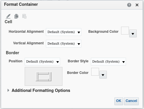
Just beneath the dialogue title, "Format Container" there are three icons, the pencil icon clears the formatting for the container, reverting to the system default. The next two icons are for "Copy" and "Paste" respectively. It’s possible to copy the formatting for the current container, close the dialogue and navigate to a format container dialogue for a different object and past the formatting there.
The rest of the dialogue is concerned with formatting of the various elements. It’s best to practice with these and observe the effects of the various options on components of your analyses.
The view properties dialogue applies to the table of data. Clicking on the
will display the dialogue shown in Figure 6.
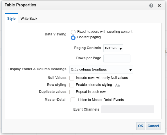
The first option, for data viewing, controls how data is retrieved as we are viewing it. Up till now we have been using "Content paging" and clicking on buttons to navigate backwards and forwards in the table of data. The "Scrolling content option" provides data in a continuous scroll that is retrieved as needs while paging through the data. Again, practice with the options and observe the effect.
The option for "Row styling" is useful. It allows a different style to be applied to alternate rows. If you turn it on then, by default, each alternate row is style with a pale green background. This can help the eye navigate the rows of data a little better. There is a format button which allows the format of the alternate rows to be adjusted. Again, experiment and observe the effect.
Referring back to Figure 4. Note the three pencil icons. These are used to control the content of the container and some aspects of the formatting of that content. The screen, shown in Figure 7, is presented if you click on the pencil icon for the title container.
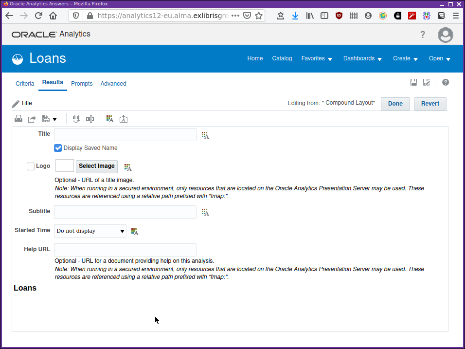
"Display saved name", if checked, uses the name the analysis is stored in
the catalogue with as the title of the analysis. A different title can
be supplied here. A logo and a subtitle can be supplied. Note the icons
which when clicked allow adjustment of the formatting of the
associated component. The bottom part of the display shows a preview of the
appearance of the component, updated as you are adjusting the content or
formatting.
The "Done" and "Revert" buttons towards the top right of the dialogue apply your changes or discard them respectively. The "Done" button leaves the dialogue so remember to "Revert" if the changes are not required. Again, experimenting and observing the effect is key here.
The video in Using the container format dialogues shows the use of these format container dialogues to adjust the formatting of the container components.
The edit icon for the filters panel is a little unnecessary as nothing of interest can be changed for that panel.
The "View Properties" icon and the "Edit View" or pencil edit icon for the table, from the results tab, and the "Column Properties" menu from the criteria tab allow us to control the layout of the data in the table. We can define our sub-totals and totals, which columns to exclude or include in the display. We can use "Table prompts" and "Sections" to split our table into parts which may help make it more manageable or clearer. The video in Table content dialogues shows the use of the "View Properties" and "Edit View" dialogues to adjust the form and content of the table.
Formatting table columns
We format table columns by working with the "Column Properties" dialogue that is available from the criteria tab as shown in Figure 8.
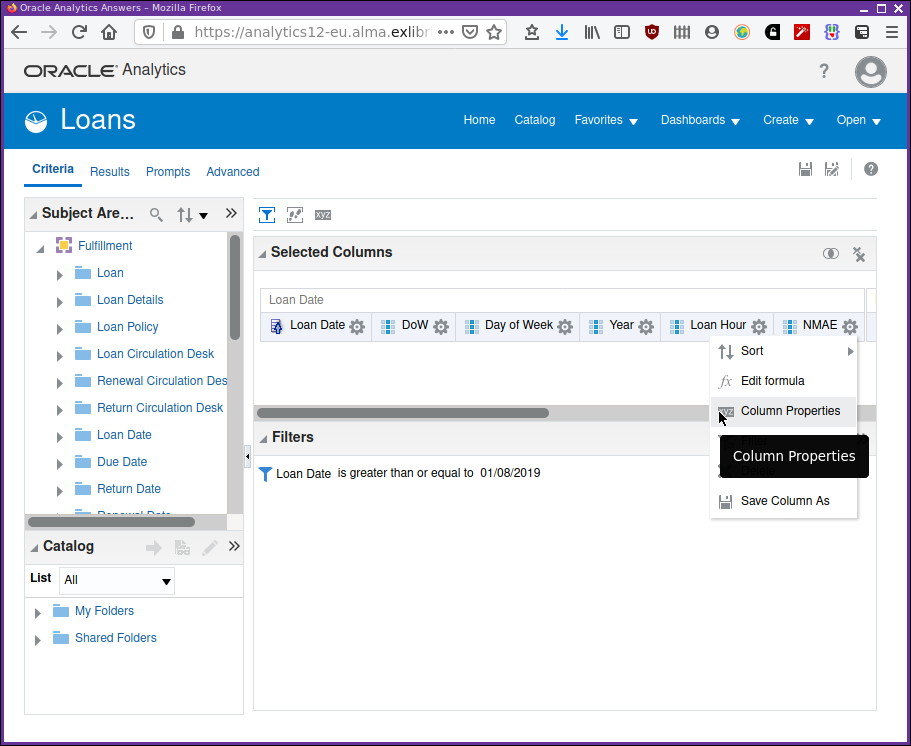
Selecting this menu item accesses the "Column Properties" dialogue as shown in Figure 9.
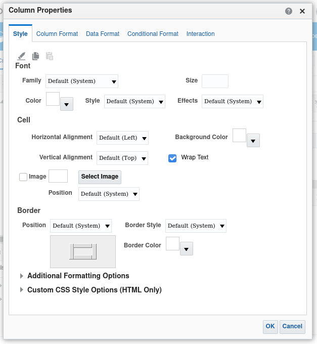
The first tab is for manipulating the style applied to the column. Most of these sorts of options have been seen before so experimentation and observing the effects is important. There is an option to add an image to be displayed in the cell alongside the data. Perhaps a red warning sign or a green go light indicating status. These could be added depending on the data content of the cell. We shall see how to do this when we learn how to apply conditional formatting to a column.
In the "Column Format" tab we can change the default headings for the column as well as adjusting their display format. In this tab there is a section for "Value Suppression". The little graphic gives an indication of the relative effect. In essence, it provides an option to display, or not, repeated column values where they might be unnecessary. Again, try it and observe the changes in display.
The "Data Format" tab provides options for the display of the data type in that column. For example, if the data type for the column is numeric then options would be available for specifying the number of decimal places, or whether to use a comma as the thousand separator.
Conditional formatting, available from the "Conditional Format" tab, provides a mechanism for changing the display format of a data cell in a table depending on the value of that data. For example, if the number of loans for a day exceeds a value we can display the value in red to indicate that some sort of attention should be paid or an action taken. Similarly, if the value is less than that threshold then display the value in green.
This is done by adding a condition, e.g. "value ≥ threshold", for the data in the column. If the condition evaluates to true then apply a particular format.
The "Interaction" tab has been covered in the "In depth" chapter.
Formatting dashboards
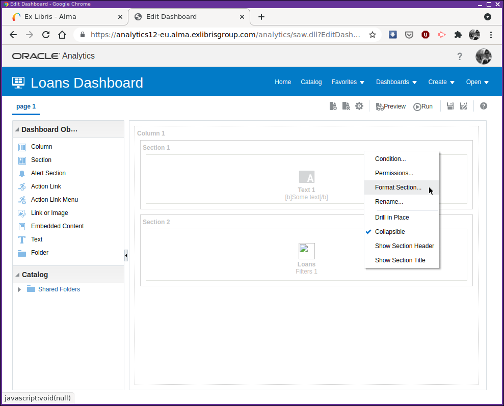
We can change aspects of the formatting of dashboards from the dashboard editor. The mechanisms provided for changing the format are the same as those provided when editing a table format. They allow you to change fonts, borders, etc, of the various layout components using the same dialogues as we have already seen. For any particular component, while in the layout editor for the dashboard, select the "Column Properties" or the "Format Section" menu items from the menu button in the top right of the component, as shown in Figure 10.
Charts
At long last, we get to the flashy bit, charting.
We add charts to an analysis by adding a chart view to the results tab in "Design Analytics". This is shown in Figure 11.
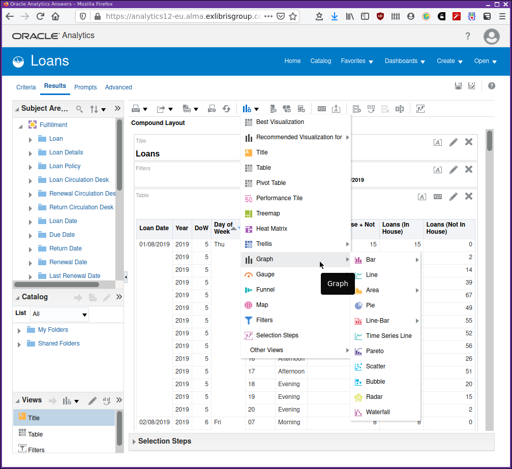
You can select "Best visualization" or "Recommended visualization" and Oracle will heuristically choose a chart type for you. Generally, it will never be quite what you need and will need some editing of how the data is used in the visualization to be what is required.
In this section we will not delve into the detail of which charts are suitable for which data. This is an enormous topic in itself. Rather, we will concentrate on adding charts and then some formatting and usage details.
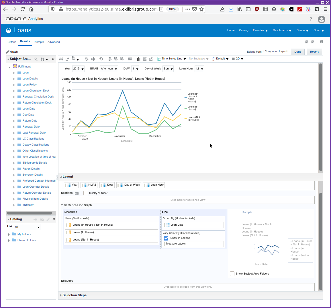
Let’s start by adding a simple time series graph measuring the daily total loans, the combination of "in house" and "not in house" loans.
So, select  . After a few moments, a chart
view will have been added to the bottom of the analysis results display. You
will need to scroll down to the bottom to see it. A graph view like that shown
in Figure 12 will be seen.
. After a few moments, a chart
view will have been added to the bottom of the analysis results display. You
will need to scroll down to the bottom to see it. A graph view like that shown
in Figure 12 will be seen.
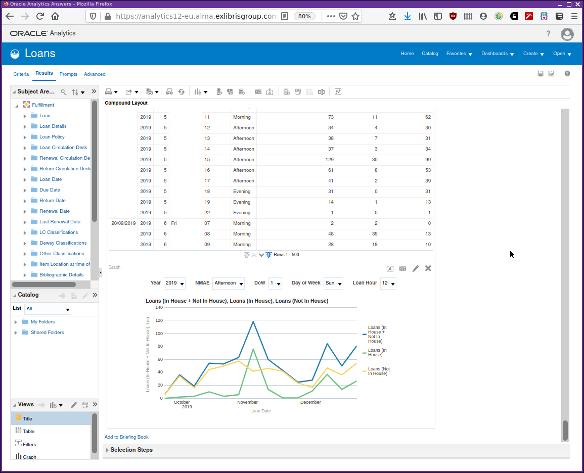
This may not quite be what you had been expecting to see. OAS has looked at the data columns for the analysis and added them all in, in some form, to the chart. So, at the moment, it probably does not look like what is required.
You can see at the top of the chart panel a line of drop down menu selectors. These prompts are used to partition the graph data and would be useful in other contexts, just not for our immediate simple time series requirement. Let’s adjust the chart view by clicking on the edit view pencil icon.
The screen shown in Figure 13 will appear. The browser tab has been "zoomed in", so that all the editor components can be seen at the same time.
The top part is an interactive view of the chart reflecting the changes made in the lower pane, the layout editor. In order to get our first desired result, a basic time series graph of total loans we need to simplify our chart. To do this, remove all the prompted data fields by dragging and dropping them to the excluded section. Do the same to leave just the total "in house + not in house loans" column in place for the vertical axis.
The result will be as in Figure 14. We can see that the physical loans pattern for 2020 reflects pandemic lockdowns and policies.
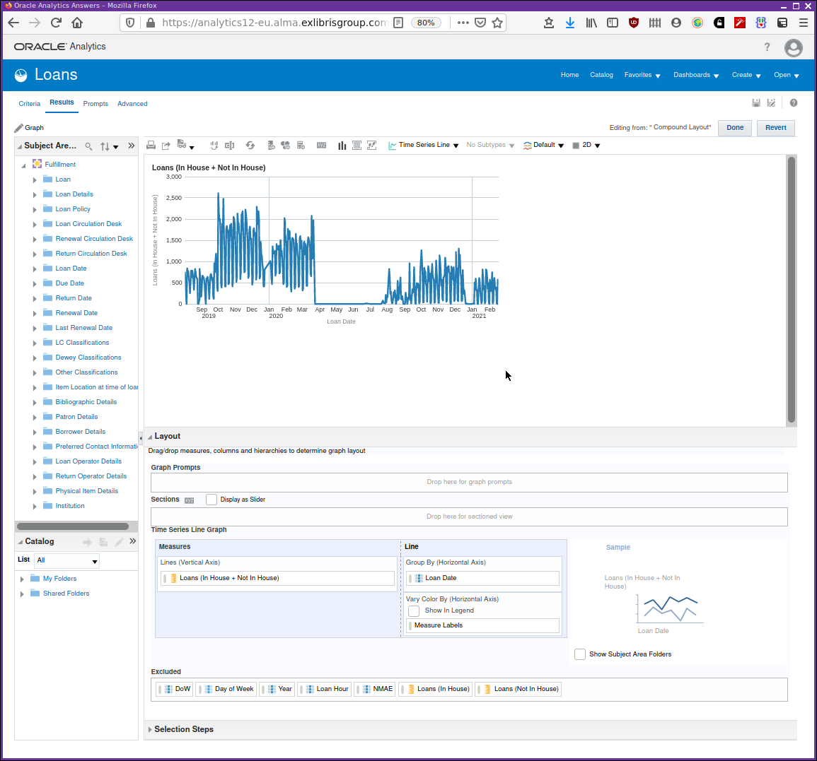
The fundamental point to remember is that when adding any chart it’s unlikely to be exactly what is required initially. It will require editing and possibly simplification in order to be clear.
In the video Adding a chart to an analysis we now explore the chart editor showing the steps taken above.
To finish this section the video Charts example using Loans explores an analysis based on "Loans" with a few different formats of charts.
Format and Style — final points
OAS provides plenty of tools for manipulating the format of your analyses. It’s possible with a bit of work to produce visually compelling analyses. It may be necessary at your institution to produce reporting that conforms to a style guide. OAS provides a mechanism to reach this goal. With the power and flexibility its also easy to produce a garish mess, so it’s worth considering whether the default, muted formatting scheme is suitable for most work.
There are comprehensive facilities for charting. Again, with the power comes the responsibility of the analysis designer to provide clear and understandable charting. Remember the warning from the beginning of the chapter. Without clearly understood and correctly derived data no amount of presentation or charting will make sense of an analytics project.
As well as the charts that are available to add to an analysis within analytics there is, since October 2020, the facilities provided by the new data visualization component. There is much overlap between the charting facilities provided by both with the new ODV providing a more modern take on charting provision.