Introducing Ex Libris Analytics
But first, "Analytics‽"
Before starting with Ex Libris Analytics, I’d like to spend some time considering what is involved in doing analytics. I had been listening to a BBC Sounds[1] podcast discussing nuance and, using trees as an analogy, they were discussing the complexity of nuance. I may be overextending the analogy a bit here, but here we go. The term "trees" encompasses an incredible variety of species, their many and widely varying habitats, their birth, life and death and the differing timescales involved. We use one word "tree" to encompass this incredible depth and breadth of diversity. And this word conveys a great deal of information to us when we use it, but also that the information conveyed will be different for various people and groups of people.
This is before we even consider what skills and tools might we may need to describe a tree we are interested in, to cultivate and to look after a copse or forest of them.
And so it is for "analytics".
Doing "analytics" in your library will mean different things to different people at different times. For example, Management and budget holders will have different reporting needs to physical circulation staff. There will be different interpretations of the word itself, ranging from printed reporting to real-time dashboards to prediction of future trends.
So, primarily, analytics initially will be an exercise in requirements specification. Who needs to know what information and when so that their functions can be performed (better?). We are trying to take data and through analytics, produce information, and perhaps even knowledge.
Next, will be an understanding of the data that is available, against which these questions can be asked. What does the data represent? Is the data sufficient? What new data needs to be gathered? What new data needs to be computed? How is the data changed (transformed) from its initial generation, through its storage and possible processing, to its presentation for use with our tools.
Now, we can use the data to perform our own transformations, and computations and possible merging of multiple sources. To produce reports for human use, or even more data for subsequent processing by other systems. It’s possible to use analytics processes to create data and deliver it to other institutional or external systems for processing.
We can test and deploy our solution and determine its effectiveness through evaluation. Then we can revisit the requirements both to see whether the requirements are met and to gather new or changed requirements. We can guarantee that requirements will change over time.
It’s clear that we will be needing an iterative approach to analytics projects. Searching for "iterative project processes" will produce no end of information and images regarding this topic.
The iterative approach is also applicable when dealing with information technology development project and analytics projects are definitely information technology development projects. While it may not appear initially that the skills needed while using the Ex Libris analytics tools are akin to software development skills they have much in common and these are transferable skills. Bear this in mind then, and we shall revisit this topic much later.
Ex Libris Analytics
We will primarily consider the Analytics system for Alma. Analytics for Primo and Leganto will differ in the data subject areas but are essentially the same to work with. We will make an immediate start with creating, developing and storing an analysis. In doing so we will be learning our way around the analytics system provided as part of the Ex Libris product suite.
For our first analysis we will explore a topic of concern to libraries with circulating physical items. Monitoring the number of holds placed on an item is a measure of the demand for that item. It’s a useful metric in managing the number of available copies. We will create and refine an analysis that considers this question, using it to explore the capabilities of Analytics.
Bear in mind this may introduce new concepts, one or two of which may appear a little confusing. Don’t worry too much, we will be revisiting these ideas in detail later.
To be able to use the analytics system you will need to have been granted the "Design Analytics" role by your APL system administrator.
Each of the sections in this introductory chapter has an accompanying short video.
Starting "Design Analytics"
From the main Alma screen, select Design Analytics and
another tab/window will open with the main analytics screen
(Figure 1). Precisely what you will be seeing will
depend on personal and institutional configuration.

The default screen for the new tab containing Analytics should be "My Dashboard", unless it has been changed in your preferences. If you’re getting started, it will be almost completely blank. We will be constructing dashboards later. For now, bear in mind, that a dashboard provides a place from which an end user can run one or more analyses.
In Figure 2 is the initial "Design Analytics" screen.
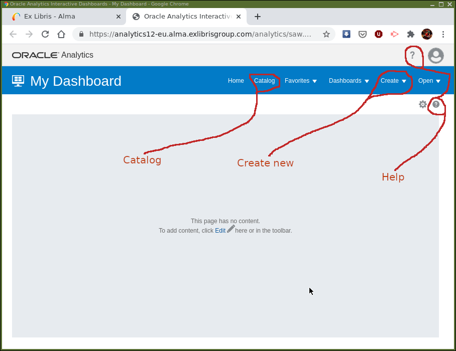
Screen components of particular interest:
-
Help— The question mark icon at the top right of the screen. This menu provides access to Oracle OAS documentation rather than anything specifically relevant to AAPL. Unless you really want to, it is probably best avoided when getting started. There is a help button, again a question mark icon, , which provides context sensitive help
for OAS.
, which provides context sensitive help
for OAS. -
Catalog— This provides access to the storage of analyses and dashboards and in OAS analytics. It has a familiar graphical file system type of interface. -
Create— Here is where new analyses and other analytics components are created.
The "Catalog" (for retrieving previous work) and "Create" menu are the usual entry points for working in Design Analytics.
Creating an analysis
From within Analytics select . The next step is to select
the subject area that the analysis will take place in. Select the Requests
subject area (you will need to scroll down to find it). We will be considering
hold requests placed on physical items. Now we are ready to create our first
analysis so let us consider the screen in front of us and how we use it.
It should look, more or less, as in Figure 3.
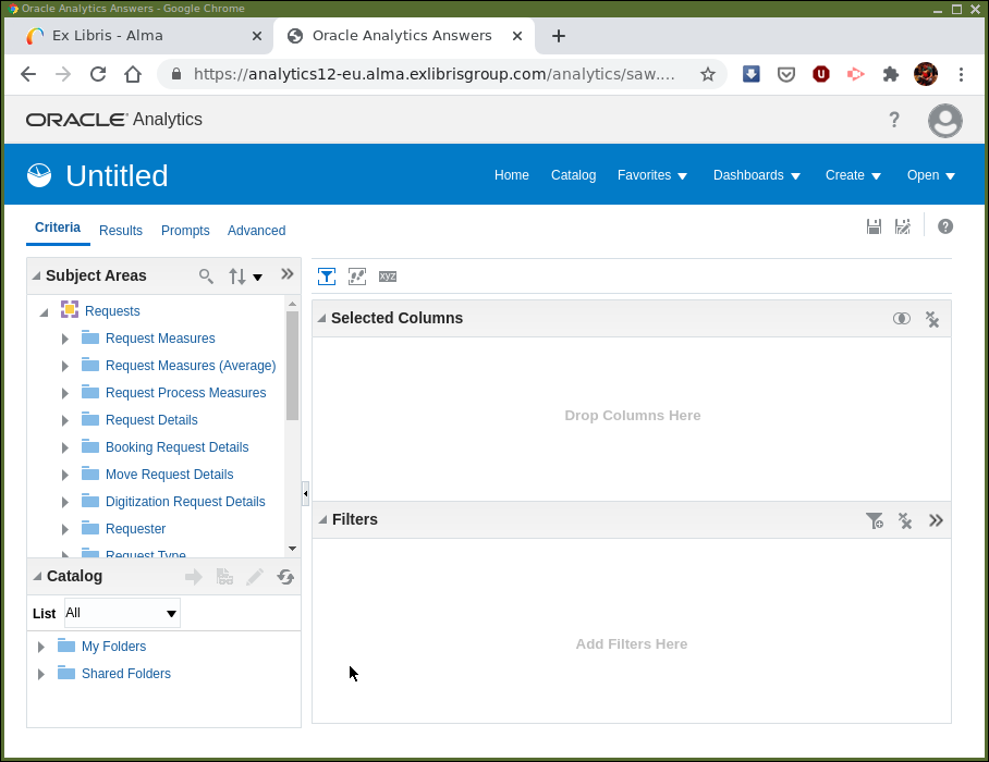
Towards the top left it says Untitled as we have yet to save this analysis
and give it a name. Located below are a set of tabs. We want to
have the Criteria tab open. It’s possible that another tab is selected
instead, if so navigate to the "Criteria" tab, so the screen looks the same as
in Figure 3.
Below this is a pane for Subject Areas and the subject area we selected,
"Requests", is displayed as … requested.
Note the main panels, the subject area, the selected columns panel and the filters panel. The selected columns panel will contain data columns from the subject areas that we have included in the analysis. The filters panel is used to add clauses restricting the number of rows of data that the analysis contains. For example, in a patron analysis we could restrict patron type to be "Undergraduate" by filtering on the type.
Before we continue we need to have a little understanding of "Subject Areas"
and how we navigate them. The "Subject Areas", are represented as "trees".
Feel free to click away and explore,  to expand the tree,
 to collapse. A subject area is represented by the
![]() icon. The folder icons,
icon. The folder icons, ![]() , are "Dimensions" containing, measurements or
descriptive data items. Little ruler icons,
, are "Dimensions" containing, measurements or
descriptive data items. Little ruler icons, ![]() , next to the name imply the data item is
a measurement value, e.g. "Transaction Amount", the data table icons,
, next to the name imply the data item is
a measurement value, e.g. "Transaction Amount", the data table icons,
![]() , indicates a descriptive value, e.g. "Creation Date". There are also
hierarchies,
, indicates a descriptive value, e.g. "Creation Date". There are also
hierarchies, ![]() , which will be explored another time.
, which will be explored another time.
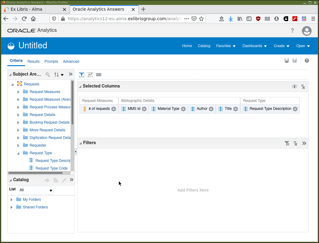
Firstly, select a column or two to display. This can be done whether in the "Criteria" or "Results" tab but for now let’s work in the "Criteria" tab.
We are using the "Requests" subject area for our high demand analysis and so are interested in "# number of requests" from "Request Measures". Other columns of interest may well be — "MMS Id", "Material Type", "Author", "Title" from "Bibliographic Details". And "Request Type Description" from "Request Type" and possibly others. Find these data items, double-click on them, or drag from the subject area into the "Selected Columns" panel where they will appear.
After this activity, your display should be similar to that in Figure 4.
Click on the "Results" tab and note that, after a little processing time, that the columns of data requested are displayed. If your institution has had Alma for a while it may be many rows of data that are returned. The display should now look as in Figure 5.
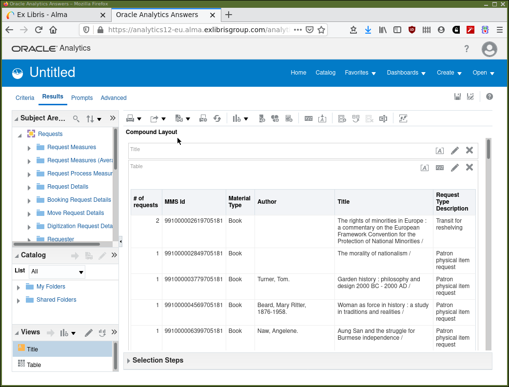
Now we have the sort of data that we want to be looking at. But we haven’t yet selected specific rows of data to make it useful for the task in hand. Looking at Figure 5 we can see that we should only be interested in physical items where the "Request Type Description" is a "Patron physical item request" but not "Transit for reshelving". Also, we probably want to be considering requests that are active and those which have a "BOOK" item material type, etc. We do this selection of data rows by applying filters on our analysis.
Let’s look at how we save and retrieve our work before continuing.
Storing an analysis
There are two floppy disk icon buttons, which, in many applications, have become the default graphical symbols to represent saving and retrieving. Unless you are an archivist, when was the last time you used an actual floppy disc‽
There is one for "Save", ![]() , and one for "Save As",
, and one for "Save As", ![]() . When first using the "Save" button in an
analysis you will be prompted for a name and a location to save in. So, as
it’s the first-time for this analysis, click on the "Save" button to save your
work. Also, as it is the first-time, it will be same dialogue as the "Save
As". Make sure that the folder in which the analysis will be saved is in "My
Folders" or a sub-folder of it. You could try to create a sub-folder to store
this analysis in. Figure 6 shows the "Save/Save As" dialogue.
It’s much like the file management dialogue as found in many
applications.
. When first using the "Save" button in an
analysis you will be prompted for a name and a location to save in. So, as
it’s the first-time for this analysis, click on the "Save" button to save your
work. Also, as it is the first-time, it will be same dialogue as the "Save
As". Make sure that the folder in which the analysis will be saved is in "My
Folders" or a sub-folder of it. You could try to create a sub-folder to store
this analysis in. Figure 6 shows the "Save/Save As" dialogue.
It’s much like the file management dialogue as found in many
applications.
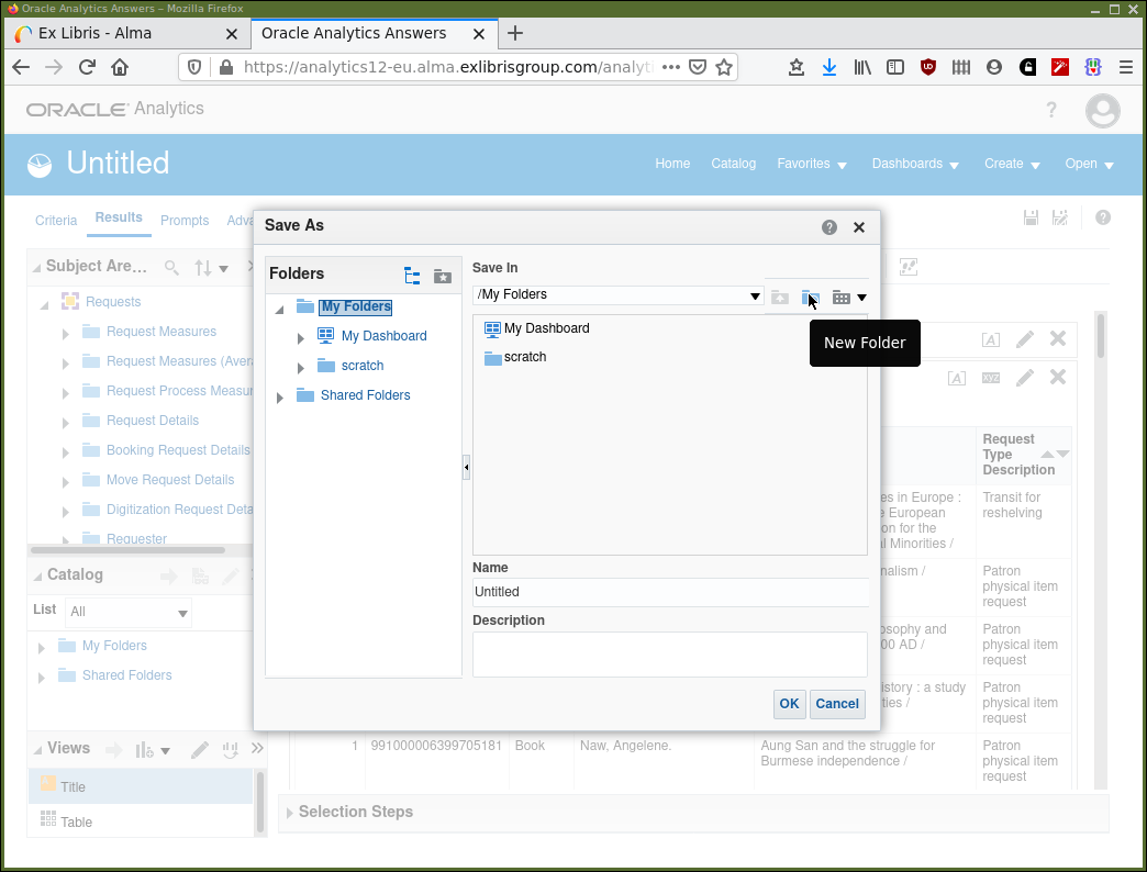
The "My Folders" folder is specific to you, a unique user of AAPL at your institution. This "My Folders" folder is visible within the Analytics system only to you. You will have noticed the "Shared Folders" folder where it is possible to share analyses with colleagues, both at your own and other institutions. It’s possible to share the code of an analysis with other institutions, but an institution sees its own data. In other words, the code forming an analysis runs using data from the institution the person running that code is at.
For now, we will save our work somewhere in "My Folders". Later we will consider sharing our work with others and the conventions involved. Note that in Figure 6 the mouse is hovering over the "New Folder" button and that this is shown in a pop-up tool tip. This will allow you to create a separate new folder somewhere in the catalog hierarchy to store your analysis.
Adding a filter to an analysis
At this point we have added data columns to our analysis but not limited or "filtered" the data returned by the analysis in any way. We are looking at large data sets and are going to have to be selective if we are going to find value in this data tsunami. We have the data columns required, but we want to restrict the rows that we are considering. We do this by applying "Filters" to our analysis.
Continuing with the analysis, first make sure that you are looking
at the "Criteria" tab. Now click on the "Add filter" icon,
![]() in the menu bar for the "Filters" panel. You are presented with a menu of
the names of the data columns already selected, in the "Selected Columns"
panel. Also, options to filter on more columns, which haven’t been selected.
It’s possible to filter on a data column which will not be displayed in the
analysis output. Select "Request Type Description" as the column for which we
are going to construct a filter.
in the menu bar for the "Filters" panel. You are presented with a menu of
the names of the data columns already selected, in the "Selected Columns"
panel. Also, options to filter on more columns, which haven’t been selected.
It’s possible to filter on a data column which will not be displayed in the
analysis output. Select "Request Type Description" as the column for which we
are going to construct a filter.
Alternatively, in the "Selected Columns" panel, note that each selected column
has a menu button,  . This is to apply a filter directly to an already selected column.
Click this button and select "Filter".
. This is to apply a filter directly to an already selected column.
Click this button and select "Filter".
In either case you are presented with a dialogue panel as shown in Figure 7.
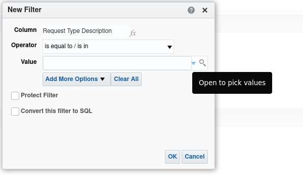
We can see that we are working with the "Request Type Description" data column. We can apply an operator to the column. Click the drop-down menu button for "Operator" to see the available operators and provide a value in the "Value" field. Note the tool-tip for "Open to pick values" that will appear if you hover the mouse over the drop down menu for the "Value" input panel.
We can use filters to say something like: filter our results to display only rows where "Request Type Description" is "Patron physical item request".
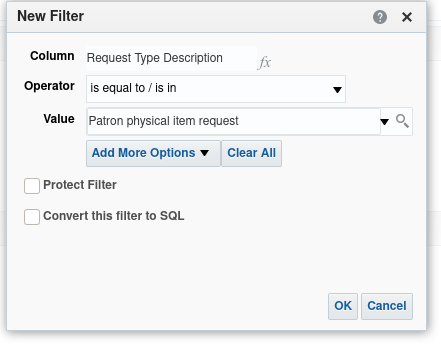
Set this up and click the "OK" button. The "Operator" will be "is equal to / is in" and the value "Patron physical item request" can be selected from the "Values" drop-down. It is possible to select more than one value here.
The "Edit filter" dialogue should now look like Figure 8
Now, when returning to the "Results" tab we should be able to see the returned data is reduced in rows and that all the rows have "Request Type Description" to be the value selected in the filter i.e. "Patron physical item request".
|
Range of values
The range of values for fields such "Request Type Description" can be
different depending on your institutions configuration.
|
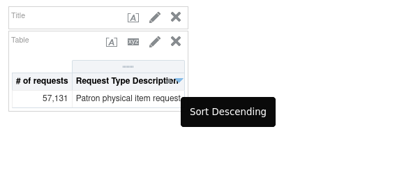
Sorting the results
As we are considering hold requests on physical items, we might wish to see our results in descending order of the number of hold requests. Then we might wish to sort further by, say, author. This can be accomplished in either the results or criteria tabs.
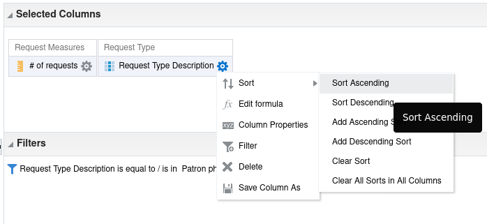
Looking first at the criteria tab, click on the column menu icon,
,
for "# of requests" and then on "Sort". You will see the dialogue shown
in Figure 9. Note that there are menu items for sort
ascending/descending and menu items for add an ascending/descending sort. The
former sorts the whole result by that sort on that column. The latter add a
sort by that column to already existing sorting. So, it’s possible to sort by
"# of requests" and then by "Author", i.e. have multiple active levels of sort.
Sorting from the results tab is intended for interactive use, as shown in Figure 10. You will see small up/down icons in the header for each column. As you mouse hover over these a tool-tip will appear indicating the action, like "Sort Descending".
Adding a prompt to an analysis
"Prompts" are a mechanism whereby, when an analysis is executed from a dashboard the person running the analysis can provide parameters, to a filter. For example, an analysis is required to produce data for a range of dates, or a material type. But, the actual values for a date or material type filter are not known in advance by the person developing the analysis.
Another way to consider this; by providing parameters in this way, a single analysis can produce different analyses. These may otherwise have to be developed individually. It’s a way of making your analyses more widely general purpose, but still be able to be directed to specific tasks.
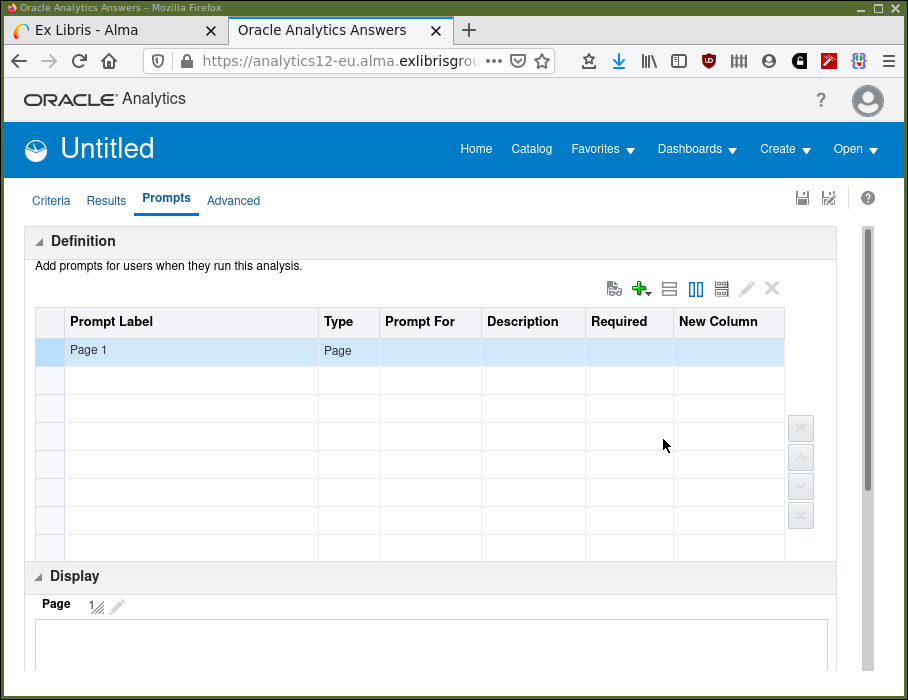
Access to developing prompts is via the "Prompts" tab in the "Design Analytics" editor. Select the tab and your screen should now look like Figure 11.
The button,  , is for adding a new prompt.
Click the button to add a new prompt and select . This will bring up the dialogue box in Figure 12.
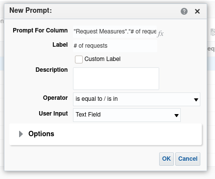
Set "Operator" to be "greater than or equal to" and "User Input" to be "Text
Field" (numbers are valid inputs to these text fields, so "text" is referring
to typed input including both text and numbers). Click the OK button and the
prompt is created. You will be able to see what it will look like in the
Display panel. It can also be tested in this display panel. Feel free to have
a little experimentation.
Now, when the analysis runs from a dashboard, the user is prompted to input a value n. Then the data rows returned will be only those for which the "#of requests" is ≥ n.
If we return to the Results tab, nothing will have changed with this display.
Remember, prompts become effective when executing an analysis from a dashboard.
To test the prompt, while in the Results or Prompts tab select the "Show how
results will look on a Dashboard" button,  . Choose the default view. A
new window will appear, and you will be able to input a value for the prompt,
click OK and inspect the results.
. Choose the default view. A
new window will appear, and you will be able to input a value for the prompt,
click OK and inspect the results.
The first dashboard
A dashboard is a place where a number of analyses can be aggregated. Like a car dashboard it will allow you to look at multiple items at, more or less, the same time. Dashboard construction will be dealt with in detail later, but it’s useful at this point to have a practical idea regarding populating them.
Let’s take a brief look at the default dashboard that we have already
seen "My Dashboard". Navigate to this dashboard again using the menu
selection and the screen should again be like
Figure 1. Click the Edit link in the middle of
the screen.
The dashboard editor screen will appear. There are tabs at the top for the pages of the dashboard, only "page 1" to start with.
There is a Dashboard Objects panel. This has a selection of components that
can be dragged and dropped into place on the dashboard where the screen says
Drop Content Here. These components are used to partition a page of a
dashboard into different functional areas.
Below this there is the Catalog panel. Navigate into "My Folders" and find
the analysis that we created earlier in this session. Drag and drop it into
the main panel. Save the dashboard and click " Run" to see what it looks like. That’s it,
that’s your first dashboard containing your first analysis.
Run" to see what it looks like. That’s it,
that’s your first dashboard containing your first analysis.
Simple dashboard population runs through the process.
Introducing Analytics — Final points
A couple of points to keep at the front of your mind while moving forward:
-
In this introduction we have:
-
Decided which data columns we want to see from which subject area.
-
Decided which rows of data were relevant and filtered out irrelevant data.
-
Sorted the results to highlight important content.
-
Added a prompt to make our analysis more useful and reusable.
-
Saved our analysis, so it can be retrieved and used again in the future.
-
Decided on actions based on the analysis (maybe buy more of items in demand).
-
Disseminated our analysis (even if only to ourselves), using a dashboard.
This is fundamentally what constitutes reporting and analytics. We will be considering more complex topics and considering details of presentation and visualization, but these seven points are the essence of all APL analytics work.
-
-
Your institutions' data is read-only in Analytics so feel free to play around and experiment. It can not be deleted by using the "Design Analytics" software.
-
It’s worth paying attention to where you store the definitions of your analyses. Be careful not to overwrite analyses that need to be kept.
-
Save your analysis definitions frequently, so you won’t lose work when analytics times out. Such as when you go for a well-earned cup of tea and a biscuit.
-
Analytics and APL appear to time-out due to inactivity at different times which might cause problems. If anything appears to be functioning incorrectly or taking too long to respond it can be beneficial to start again. The "Design Analytics" equivalent of "turn it off and back on again" is:
-
Save your work, if possible.
-
Close the "Design Analytics" tab.
-
Logout from APL.
-
Login to APL and start-up "Design Analytics" again.
-
Exercises
-
Play. Investigate. What happens when I click this? And that?
-
In our embryonic Physical Requests analysis we might only wish to consider requests that are currently active now. We might not want to consider requests that may have been cancelled or have expired or been fulfilled. Adjust the analysis to accomplish this. You will need to find the "Request Status" column in the "Request Status" dimension and filter for only "Active" requests. Make sure to save your work afterwards!
What effect does filtering for active requests have on the numbers being displayed?